
Data Set Discussion Tool - A Visualization Prototyping Tool to facilitate shared Understanding
Description
A Visualization is a representation of the data as visual elements such as shapes, position and colors to generate an image that ensures an effective use of our natural visual capabilities of recognizing patterns and outliers. This results in amplified cognition, insight generation and helps support decision making (Ware 2000, Spence 2001 1, 2). Interest in visual representations of the data spread from graph theory, sociology, and scientific communities to all major fields such as Humanities, Art, and Chemistry, not just due it’s inherent qualities of providing quick and effective interpretation of large amounts of data, but also due to availability of commercial tools and open source toolkits that enable users to quickly transform data into not just simple, but also complex visualization designs and interactions. Wider and casual interest in information visualization has been encouraged by open source datasets and visualization sites like Many Eyes and Gap minder, where communities can share and discuss Visualizations. However, there still exists the traditional scenario where the domain and the tasks are complex and the domain experts require a custom visualization to assist in their work related problems. As a result, visual designer s are brought on board to understand the problem, gather requirements from the domain experts and then design and create Visualizations to be tested by the domain experts. The purpose of this project is to enable domain experts to also participate in the design of a visualization.
“A graphic is no longer ‘drawn’ once and for all: it is ‘constructed’ and reconstructed manipulated until all the relationships which lie within it have been perceived…a graphic is never an end in itself: it is a moment in the process of decision making. </em>(Bertin 1981, 1)
As Bertin said, while creating data representations you learn more about the data and relationships within the data. With the help of this new understanding about the data you can improve the design of your visualizations. The domain experts have strong and deeper knowledge about the data and its relationships than the visual designer. Therefore, we propose that the domain experts should be involved in the design of a visualization. To understand and evaluate such collaboration. We built a tool, Data Set Discussion Tool, to provide an interface that can be used by both types of users to share their area of expertise. The tool enables the domain expert to explain his data to the visual designer using bubbles. We believe this means of communication will foster a greater understanding of the domain and the requirements by the visual designer. Fig 1.1 shows how a domain expert can utilize the tool to explain the data, presented in the left Original Data panel. The domain expert can use the right panel to explain the relationships between the data columns represented by bubbles. Moreover, the bubbles can also be used to explain the requirements for the visualization.
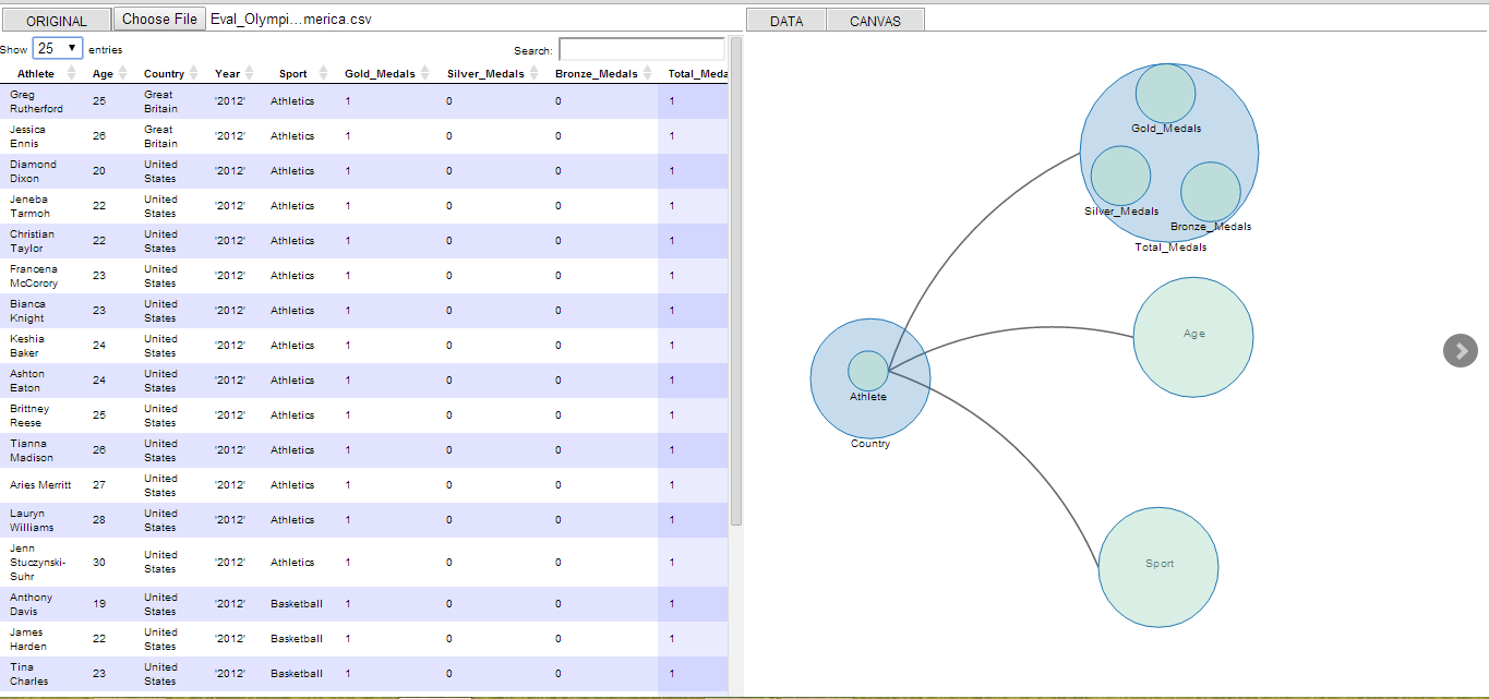
Fig1.1. Using Columns as Bubbles to explain the Domain and Visual Requirements
The tool also enables the visual designer to show sample visualization designs and break these sample visualizations into thier visual components (visual variables by Bertin), such as Shape, Size, Value and Color. As a result, it fosters better understanding of how data is encoded into visualizations and how to percieve a visualization. Fig 1.2, shows sample visualization designs in the Visual Panel (on the right). The Visual Designer has selected the Bubble chart and the size visual variable, to show how size can be mapped in this layout.

Fig1.2. The Bubble Chart Layout displaying sorting bubbles based on Visual Variable,Size.
The domain expert and the visual designer can create visualizations together for exploratory data analysis, as shown in Fig1.3. Looking at these visualizations they can discern whether a predefined layout lacks support for a true representation of the data and a more useful explanatory visualization is required.
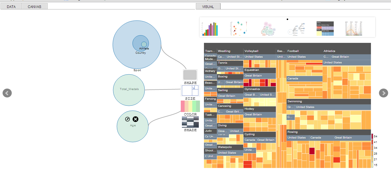
Fig1.3. Mapping Visual Variables of a Design to Data Bubbles
The Visual designer can also reuse code generated from these prototypes to make them more useful. For example, adding details to the visualization, linking these visualization, and so on.